• Work
  • About
  • Blog
  • Contact
Joshua Berman Design
  • Work
  • About
  • Blog
  • Contact

Fullsteam Brewery, Durham NC

At the end of October, Olivia and Imoved to sunny Washington, DC. It was quite a whirlwind experience: Olivia received a truly unique and exceptional job offer at Georgetown University. We jumped at the opportunity, selling a bunch of stuff, getting a renter in our house and moving up here in just shy of 3 weeks. We've only begun to see the sights, and on occasion I will miss our home in the south.

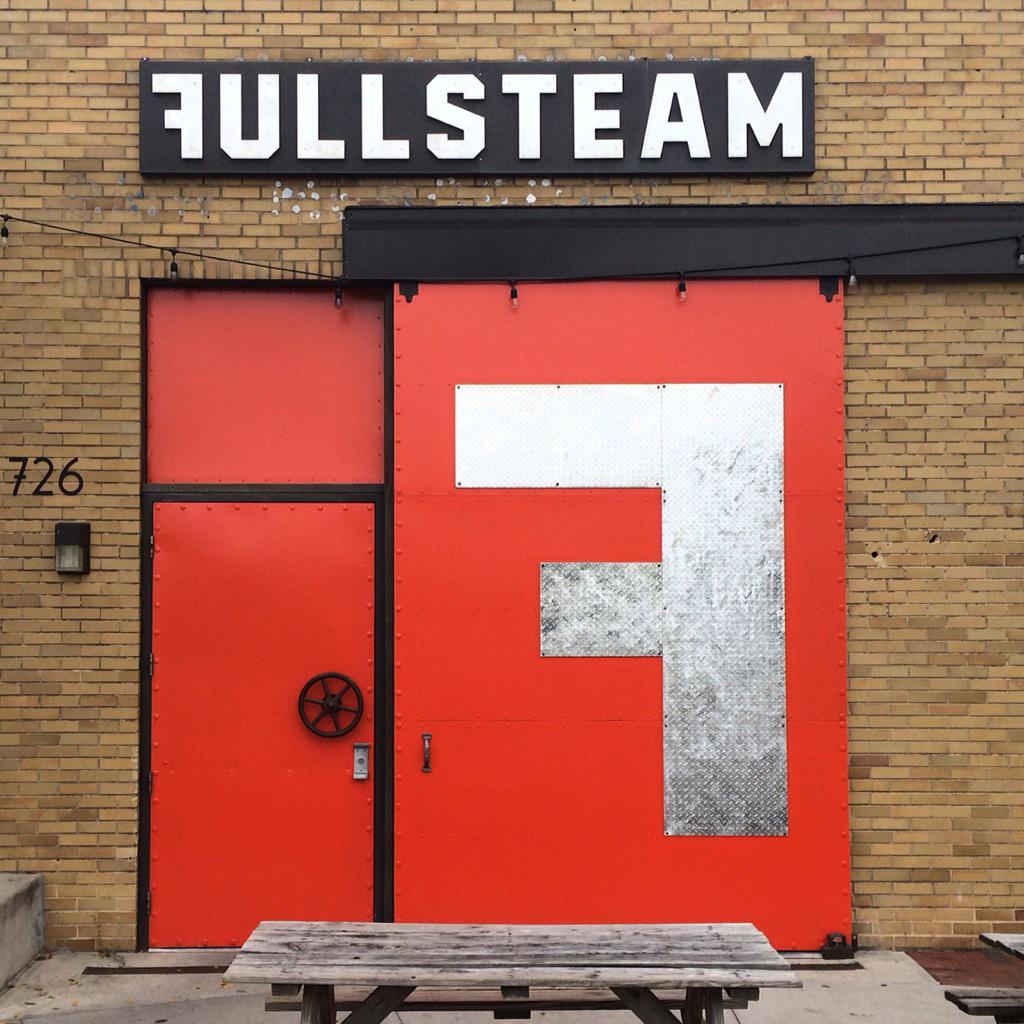
Right down the street from where we used to live is the locally (and regionally) legendary Fullsteam Brewery. Founded by Sean Lily Wilson, the self-styled Chief Executive Optimist, in 2008 the Fullsteam taproom has become a cornerstone of the Durham community. Sean, please feel free to comment and correct any errors in this post. The proximity to Fullsteam and the lively-as-of-late Rigsbee Avenue was a non-insignificant factor in the purchase of our house.

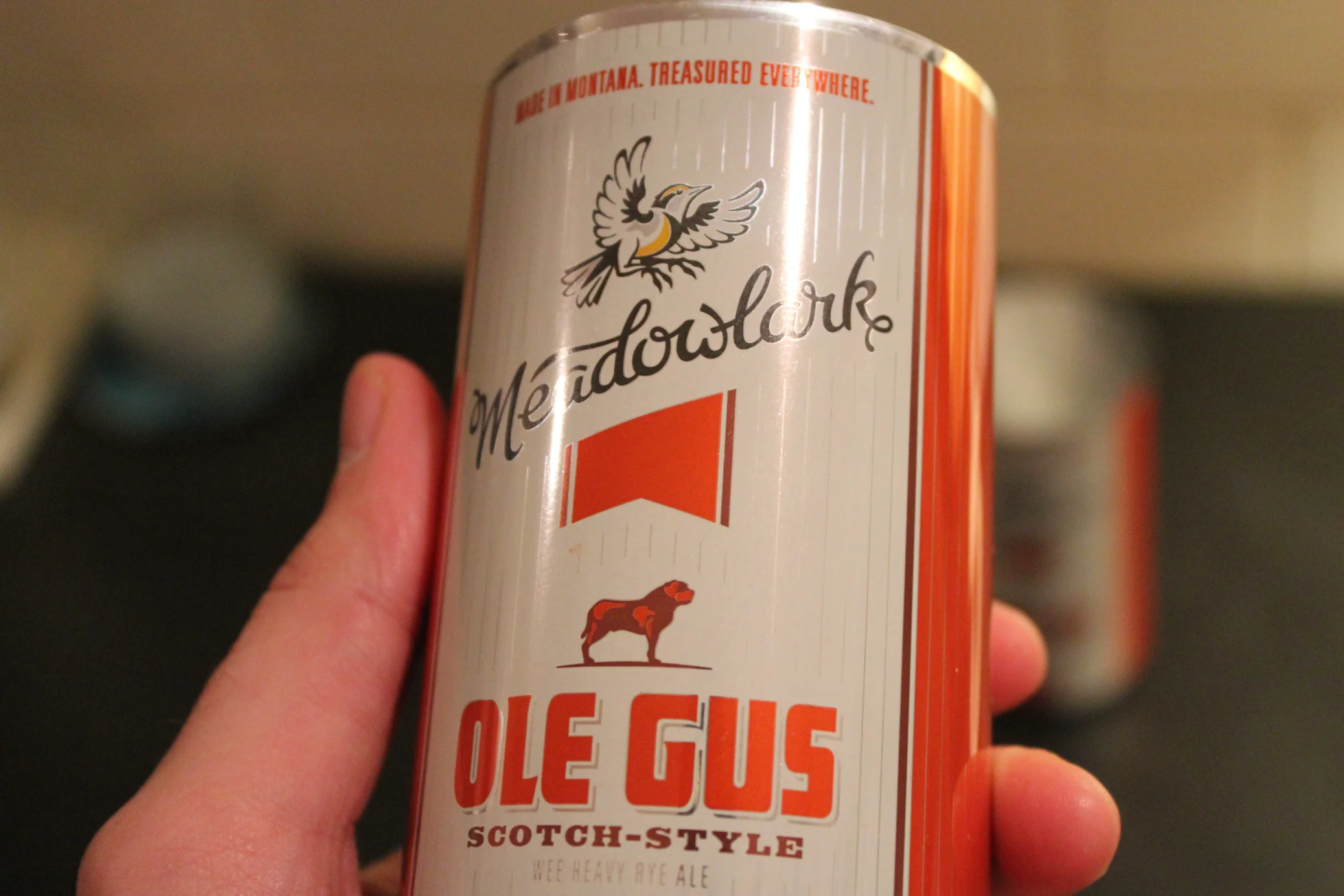
I've been working with Sean in my role at The Brandit for almost a year now, after meeting him shortly after we arrived in Durham in 2012, and since then we've done a bunch of really fun stuff together.

Fullsteam brewery anniversary posters

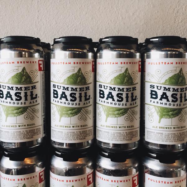
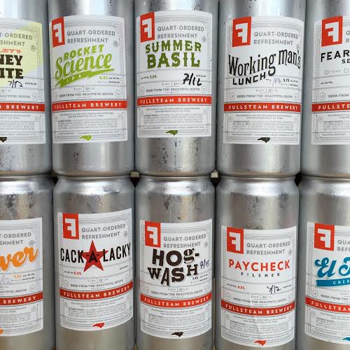
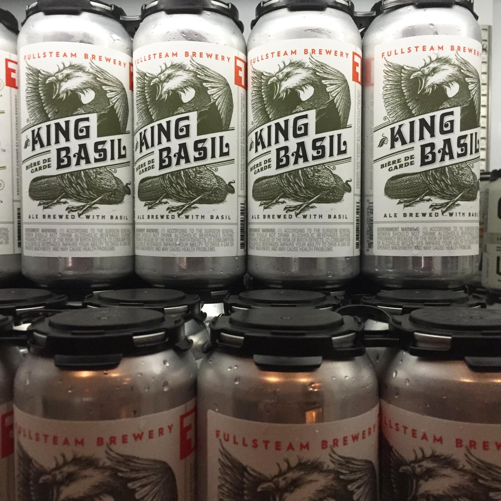
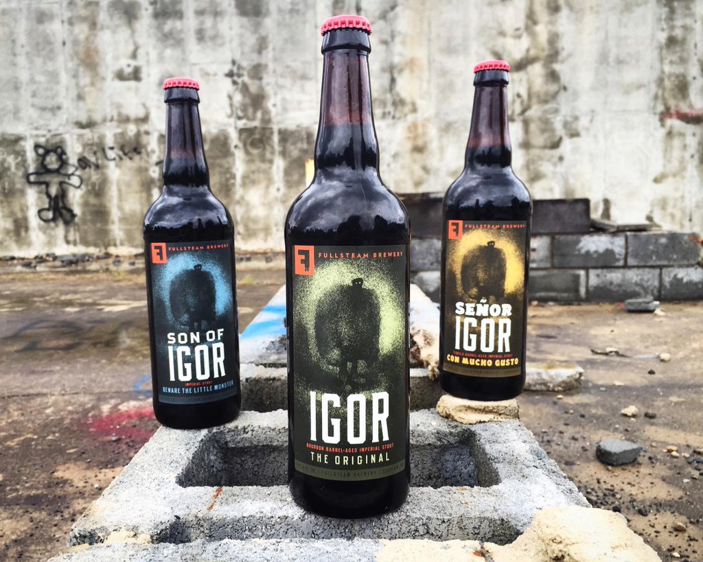
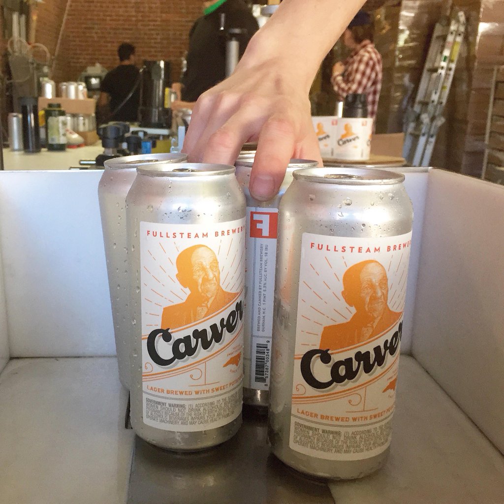
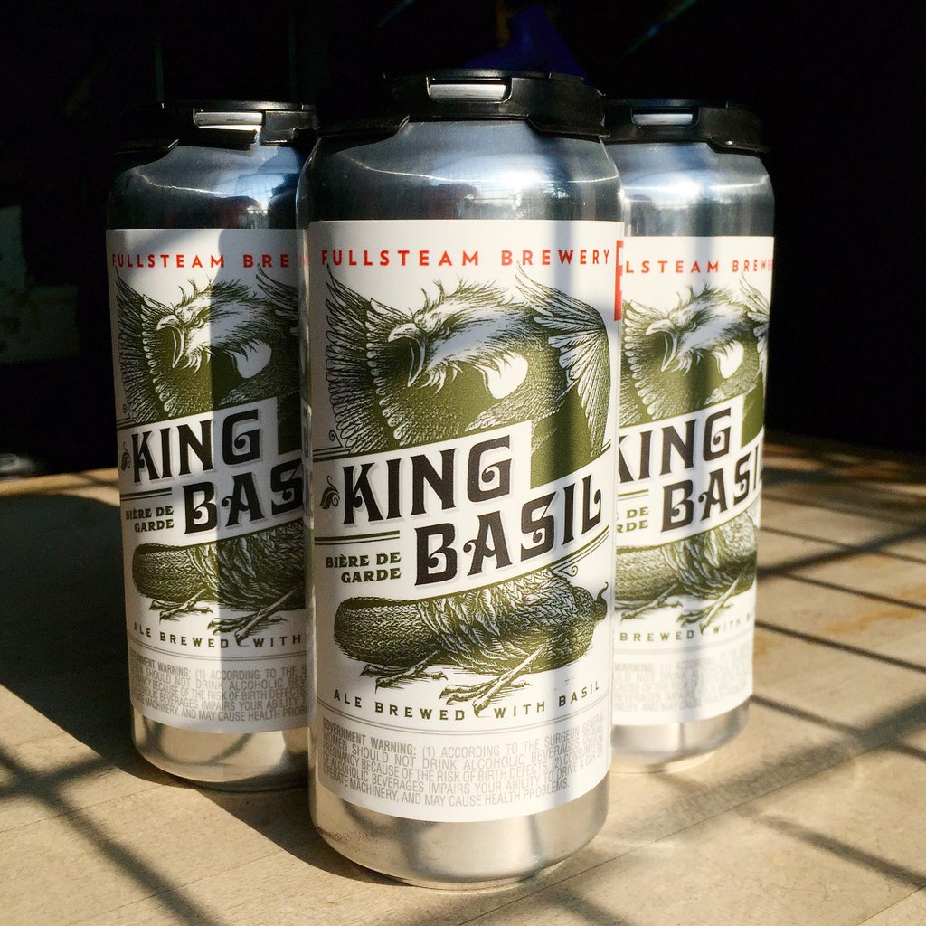
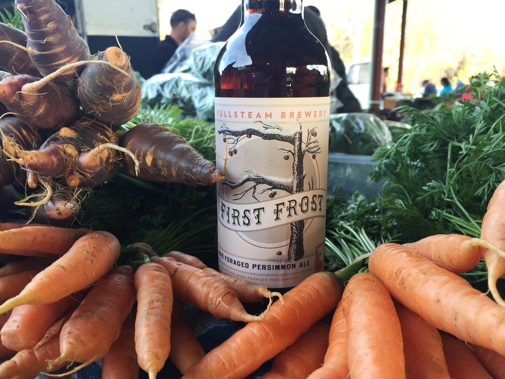
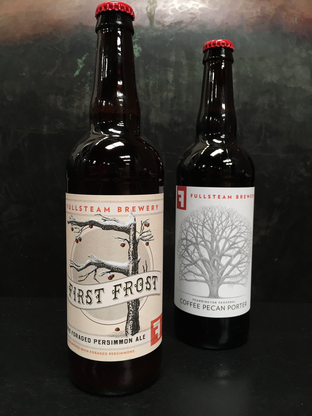
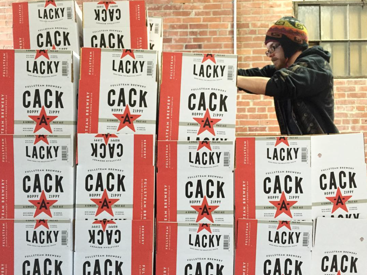
Here is a sampling of their recent Twitter images, all of them featuring projects on which I worked.

CNaTWGrWoAA25H-.jpg-large.jpeg
CNcd5JNWcAE1id9.jpg-large.jpeg
CQLjWFaWUAAn5rt.jpg-large.jpeg
CQpiea2UcAAsMn2.jpg-large.jpeg
CNXglQXVEAEw6CL.jpg-large.jpeg
CUmpV4EWwAI3_ni.jpg-large.jpeg
CURveGXWEAAEfvy.jpg-large.jpeg
Screen Shot 2016-03-04 at 4.04.30 PM.png
CNaTWGrWoAA25H-.jpg-large.jpeg CNcd5JNWcAE1id9.jpg-large.jpeg CQLjWFaWUAAn5rt.jpg-large.jpeg CQpiea2UcAAsMn2.jpg-large.jpeg CNXglQXVEAEw6CL.jpg-large.jpeg CUmpV4EWwAI3_ni.jpg-large.jpeg CURveGXWEAAEfvy.jpg-large.jpeg Screen Shot 2016-03-04 at 4.04.30 PM.png
tags: beer design, beer can design, Fullsteam Brewery
categories: Design, Packaging Design, The Brandit
Friday 03.04.16
Posted by Joshua Berman
 

The Beer Can Press Check

Alternate Title 1: A Surprisingly Analog Step In the Digital Design World

Alternate Title 2: There Is No Substitute For Your Own Eyes

I'm currently sitting in the Denver International Airport, awaiting my redeye back to RDU. This morning I spent in a factory in a Denver suburb, comparing colors on shiny aluminum to their CMKY-printed counterparts. Hangar 24 Craft Brewery is going to release their Betty IPA in 16oz cans, and the colors need to at least approximate the color on the paper labels. I'm pleased with the day's work, and know the client will be happy with how nicely it matches, even given the limitations of printing on a can.*

When trying to explain this to some friends, especially the flying-out-expressly-for-this-purpose part, the main response I got was "why don't you just mail it?" If we were only changing the color on the can once, this might work. All I have to do is see it in person, compare it to the label, and then give the thumbs up, right? Sort of.

Let's say the pressman selects some colors from their pre-printed catalog, and 2 of the six colors are accurate enough for the client's (read: my) liking. That's great. But four of them aren't quite there yet. Many colors exist in their catalog, from which I could choose. That saves time over a custom-mixed ink (about 30 minutes to an hour per color), and given that most can manufactures allot one day for you to approve colors, this makes a difference.

Access to the catalog is one reason to be there in person. In some cases (like when I was press checking Meadowlark Brewing's* cans back in April) there is no catalog: only a bunch of boxes with aluminum swatches in them.

Let's keep going with Meadowlark for a minute. In this case, they had no ivory color in their "catalog" that was acceptable. The closest color was a tan-ish beige. We want a really classic but slightly aged look for Meadowlark Brewing, and the beige was just too dark and dingy. So we mixed a custom ink, cutting that beige with white. We repeated 6 times until we got it right. You can't do that over the mail.

“Advice from an old tracker: you want to find someone, use your eyes.”
— Malcom Reynolds, Serenity

Photos don't work either, because you don't always have control of the monitor or camera settings, and colors regularly look different in person than on screen. This is one of those situations where there is no substitute for being there. It's surprising to think about, given how much of my job I do over the phone (almost all of it). But there are a few, important situations where it is essential to be there. 

Here are a few more images of the Meadowlark can samples I brought home.

IMG_4180_small.jpg

I'm very pleased with the way they turned out. Using the aluminum of the can as a pinstripe adds a great visual texture. Dan Bowman (Creative Director, The Brandit) designed the framework for the can, and I did all the art and type. The custom script for Meadowlark I'm particularly fond of; the whole brand is about 40% automotive, 40% baseball, 20% Midwestern nostalgia. Kind of fun.


Also, here is a video I took of the printing machine in action.

*Cans can generally only take 6 colors of ink, and any attempt to place a gradient requires a lot of technical manipulation. It can definitely be done, but it's often not worth the headache. We did a little gradient on this product to get it to match the heavily-stylized Hangar 24 illustration. Additionally, when the can is "scrunched" at the top to put on the lid, it affects the art. The ink at the top of the can has to "flex," so a special type of ink, called a dye ink, is used there. But dye ink is more expensive so it's generally not used on the rest of the can.

*You can also see the finished cans on Meadowlark Brewing's Facebook page.

tags: beer design, beer graphic design, beer branding, art direction, beer packaging design, beer can, beer can design
categories: Branding, Design, Lettering, Packaging Design
Monday 10.05.15
Posted by Joshua Berman
 
Newer / Older

WORK  |  ABOUT  |  BLOG  |  TESTIMONIALS  |  CONTACT  |  COPYRIGHT JOSHUA BERMAN 2016