Welcome to the new and improved JoshuaBermanDesign.com. Maybe I should start by giving a nod to the friend who convinced me to take the blogging plunge. Chris Johns and I have been friends since high school, when I used to wipe the floor with him playing Age of Empires II. He can now beat four of me at once on that game, so apparently that merits him giving me professional advice.
Johns is a motion, video and graphic designer from Keller, Texas. He is beginning to garner some traction online and in the local community, and asked me to develop a logo for his website.
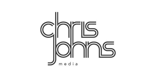
As Johns develops more products and services under his name, like pre-designed intro bumps for videos, countdowns and other video resources, he needed an identity system that would allow for flexibility with those different products. I chose a simple, text-based solution. He can easily change out the "media" in his logo for "videos" or "promotions," and any other products.
new chris johns logo
We briefly spoke on the logo after completion. Here are some of his comments:
"My current logo was lacking in the versatility area... I knew I needed something that would succeed on the web, in print, AND in video... The largest challenge with the new logo was finding one that worked in so many different mediums. I needed something that would easily translate to all of those... I needed something that could animate really well.
"One of the coolest things is that it matches my existing website almost perfectly, regarding style, but it has set a new vibe for the website. It is iconic, but it can also lay as watermarks over videos and stills... It helps set the brand for the site that I never had before in my old logo."
Thanks for the kindly remarks, Chris. He has already made this simple intro animation with the artwork, and looks to make more in the future.
[iframe: src="http://player.vimeo.com/video/18351533?portrait=0&color=ff0179&loop=1" width="500" height="281"class="large_video" frameborder="0"]


