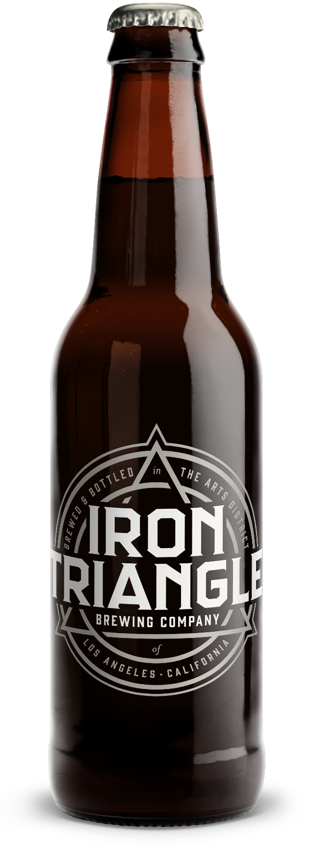
On occasion it's fun to go back and examine some work that didn't quite make the cut. Roughly a year ago, while an art director at The Brandit, I began working on an identity system for Iron Triangle Brewing Co. in Los Angeles. Thematically, they were very interested in the story of Milliam Mulholland, Fredrick Eaton, and Joseph Lippincot: the three men who built the LA aqueduct at the turn of the 20th century. They wanted to make sure that the imagery of the aqueduct was somewhat visible, or at least homaged in the creation of the artwork. Creating a suite of icons and logos was important, as well.
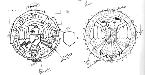
I ran across it an early version of the identity system that didn't make it past the second round, and thought it was really cool. The name "Iron Triangle" combined with the imagery of an aqueduct made for a conceptual challenge, and the linkage of two strong geometric shapes is an elegant way to square, or triangle, that circle. Negative space at the linking points creates a swirling effect, reminiscent of water propelled through a tube.


“William Mulholland was a self-educated man, but in 1914 the University of California at Berkeley bestowed on him an honorary doctorate degree. The inscription on the diploma read ‘Percussit saxa et duxit flumina ad terram sitientum’ (He broke the rocks and brought the river to the thirsty land).”

During the research phase, we found this interesting bit about William Mulholland. The inscription is wrapped around the tertiary logo, which was intended as an interesting button, or perhaps even embossed on the bottom of the bottle if we pursued custom glassware. One version utilized the original latin, for even more classic character. The secondary logo feels the most like swirling water, and was to be used as the crown.
The identity system works especially well on black.